As the first employee at an early stage start up, I was trusted to help design Visbit’s first product, Pixbrite. I was responsible for the product’s strategy, the detailed UI mocks, and the delivery to the engineers. I also worked with print vendors and a visual design contractor for illustrations.
I worked cross-functionally between the engineering and marketing teams. I communicated with different engineers periodically to ensure that the product was made correctly in an achievable timeframe. I worked with marketing to create print materials as well as organize usability testing.
Since the beginning of the decade, integrated cameras in mobile devices have been able to deliver high quality photos allowing people to capture moments and tell stories. We are constantly capturing a plethora of different photo content whether they are more special moments like a wedding or an everyday moment like a picture of your Sunday brunch. According to this article, 1 trillion photos are taken on a phone every day, with an average of 8 photos taken a day. Visbit’s first product, Pixbrite, aimed to solve photo organization particularly in the mobile space, utilizing deep learning technology.
With so many photos taken every day, it becomes harder to organize albums or search for a specific photo. The challenge brought forth when I joined the company in 2015 was to solve the organization and storage issues that people had day to day. Essentially we asked ourselves “how can we make a better iOS7 Camera Roll?”
Hard time organizing photos
Cannot always find a specific photo in their Camera Roll
Run out of storage because they take too many photos
We kicked off the research to verify the concept and also identify the market this product would potentially be geared towards. We ran surveys and also utilized tools like App Annie to try to find patterns in data.We learned that millennials, particularly females, were more interested not only in organization but also taking photos to create content with. Most of the younger generation had 16GB iPhones, so they ran out of storage quickly. Taking a step further, we canvassed college campuses to gather qualitative data.
It was interesting that people who were very active on social media all had separate apps for editing photos before posting. If they were sharing a moment that needed to be explained with more than one photo, the medium would be a collage or a video. This type of user was motivated by sharing the moment with friends. Another type of user was more interested in quality of beauty and motivated by receiving social likes. The research helped us redefine who potential users were: people who wanted to share moments within the day.
The release of Google Photos in May 2015 scrapped our concept of storage. We learned that their deep learning computing happens in the cloud, so automated collages were not editable for their end user. Our deep learning happens in the cloud and gets sent back to the client, which gives our users the ability to edit automated content. This setback actually really helped refine what our product would be focusing on – automated organizing and content editing. The goal was not to get a user’s data, but rather their time spent on the app, self consuming utility that could be shared out to social platforms.
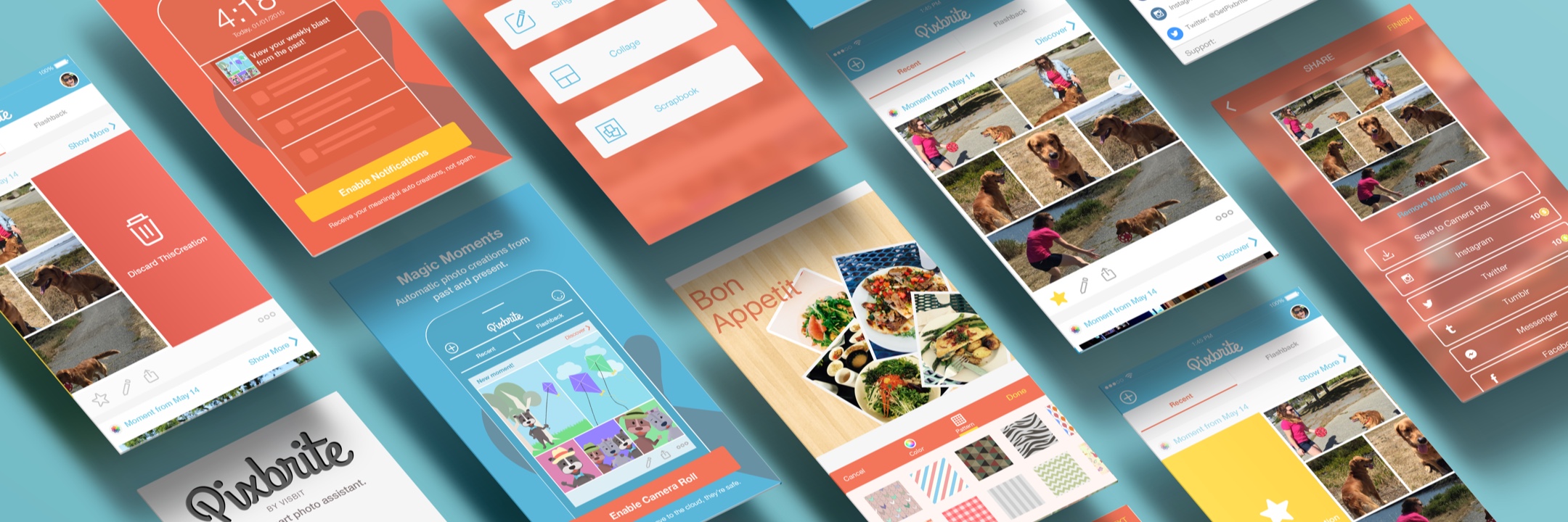
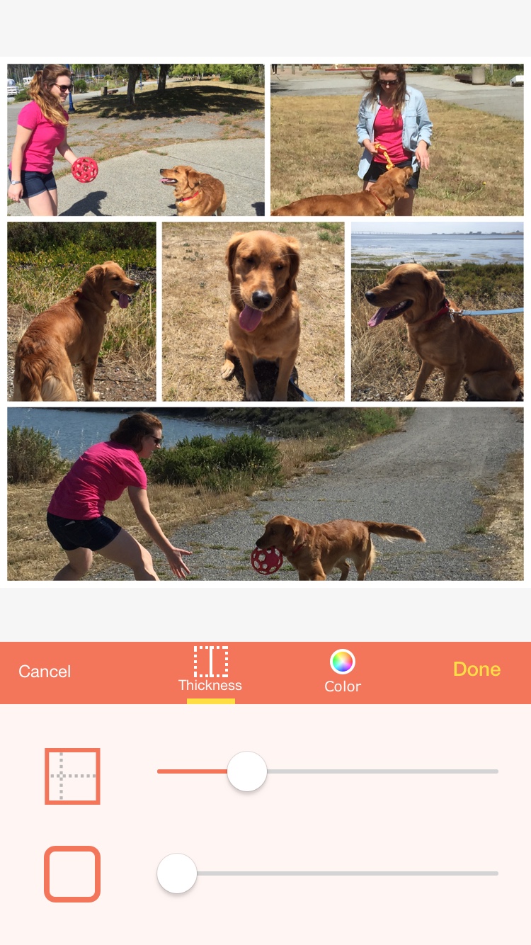
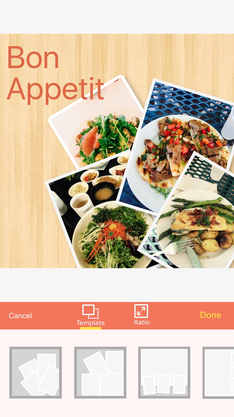
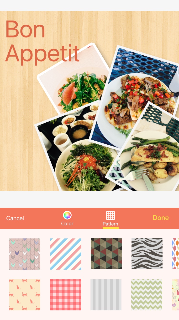
After exploring many designs, our beta was shaping into a testable product. The app was divided into three parts: organization, creation, and profile. There was a management section where a user’s photos from external platforms (Facebook, Instagram, Etc) as well as their Camera Roll were organized. The collage editor gave user’s creative freedom, but would help with a user’s time spent on the app. Profile housed favorited photos as well as creations made, but also automated collages we made with the deep learning technology. Our initial thought was automated collages might be not be seen or hard to understand if made into its own tab. We ended up inserting this automation in the profile tab as “suggestions.”

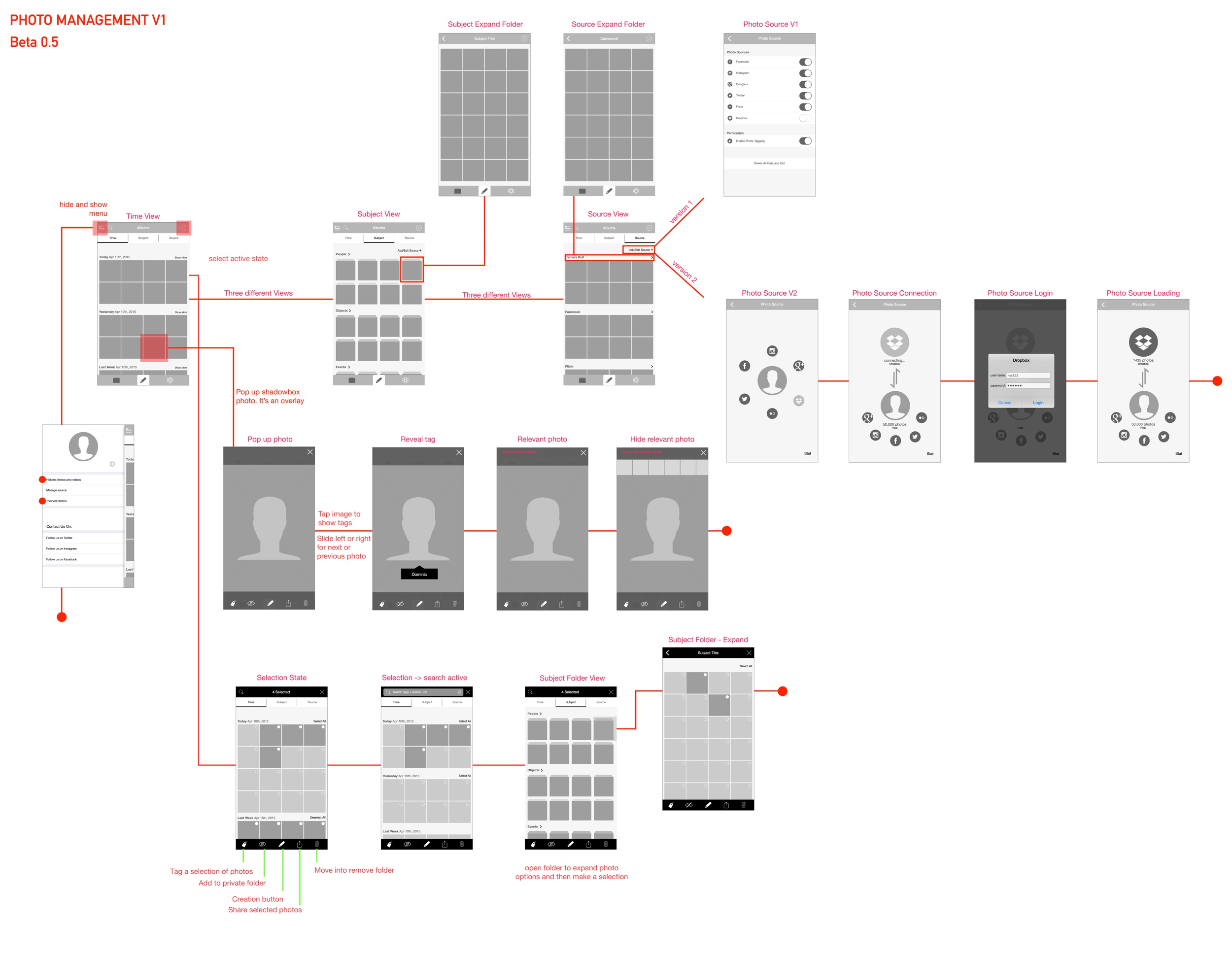
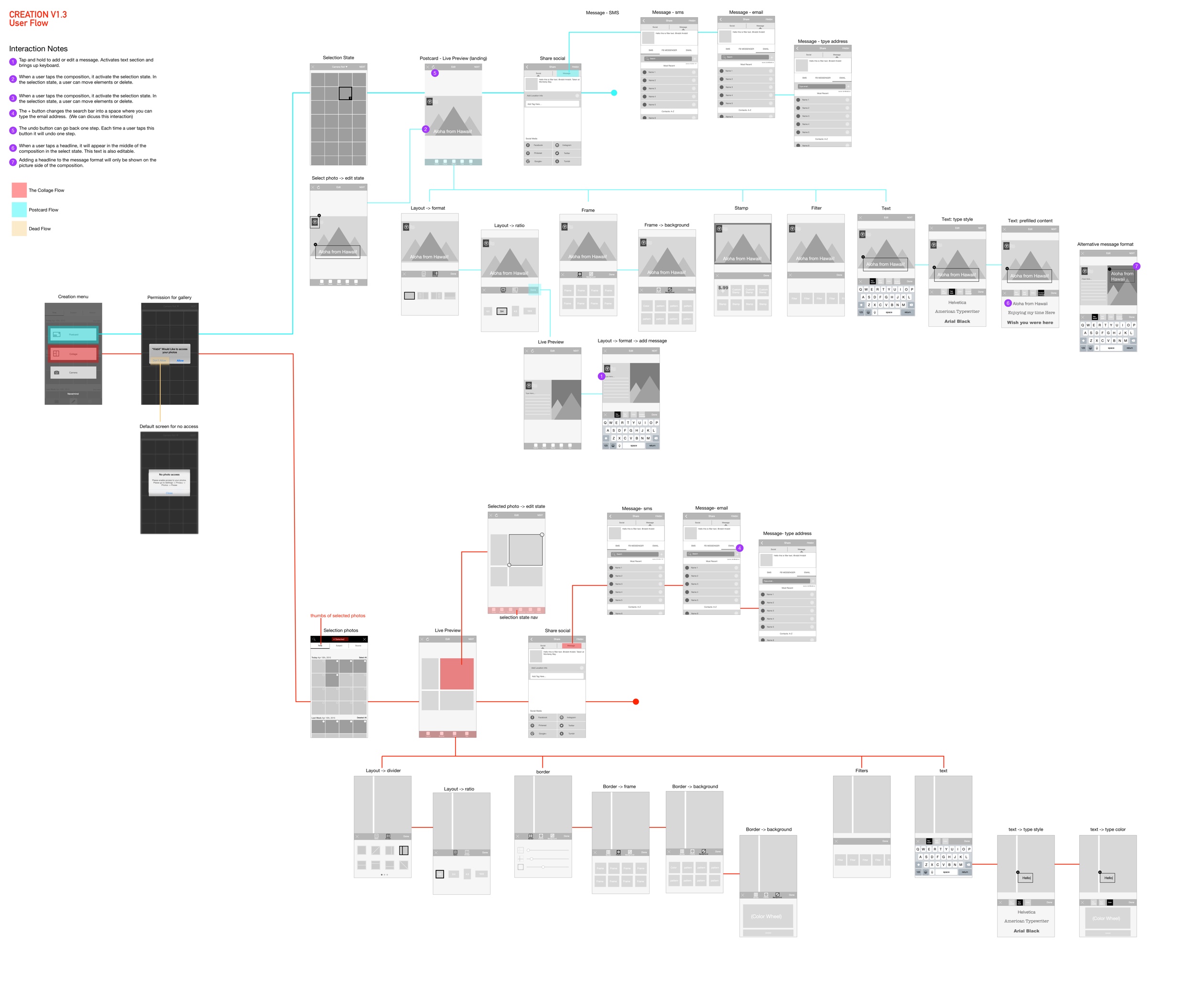
Flowchart and interaction maps for the beta product.
This is the Beta UI that went out as Pixsi, our testing app.
We put the unofficial app on the app store, while also bringing people into test our app for user testing. We learned that automated moments were not as noticeable at first, however more people actually wanted to see more automated collages as they thought it was interesting and different. It still felt a little invasive; some people felt like it was an ad since it automated, rather than an in app function.
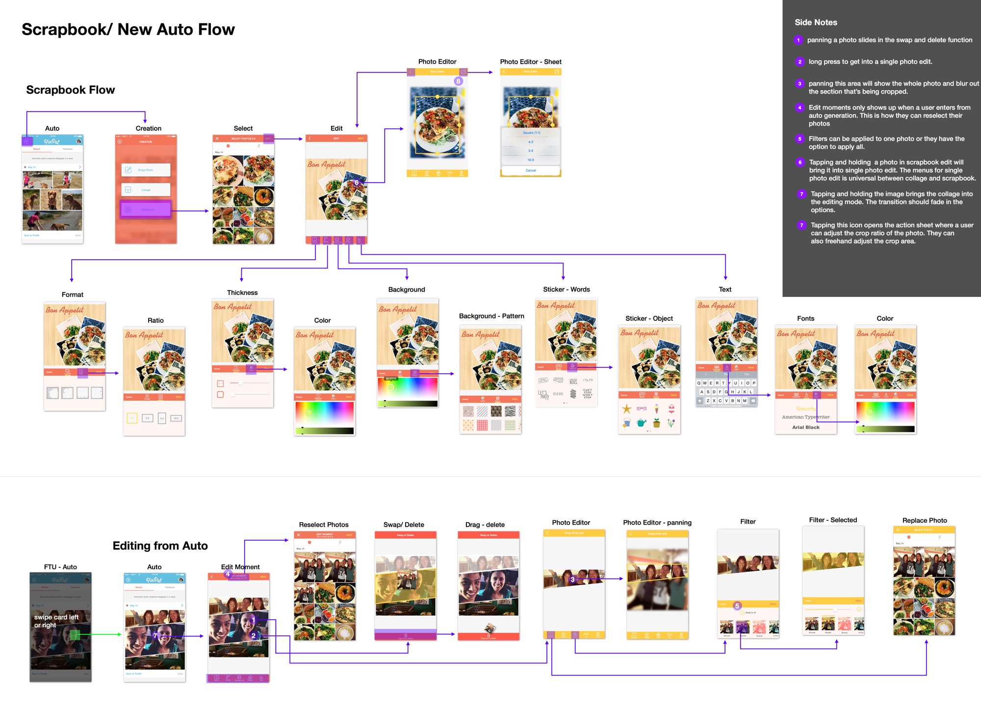
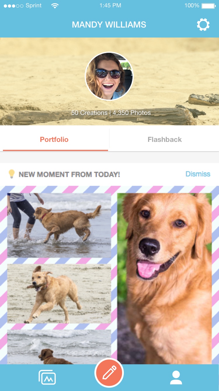
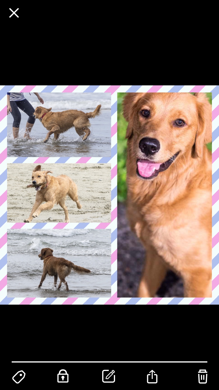
Post user testing, we learned that the most interesting feature was our automated collages. We also learned that the organization tab did not benefit the user much. We restructured the flows to have the app centered around these “automated collages/moments.” Photos were organized into automated moments that were essentially editable collages. They represented a group of related photos that a user took during a period of time. They were made based on criterias like time, location, and the content inside the photos. What was more interesting was we could allow users to discover related photos based on what was inside their moment. If there were photos with a cat, there would be other cats in the related photos section.
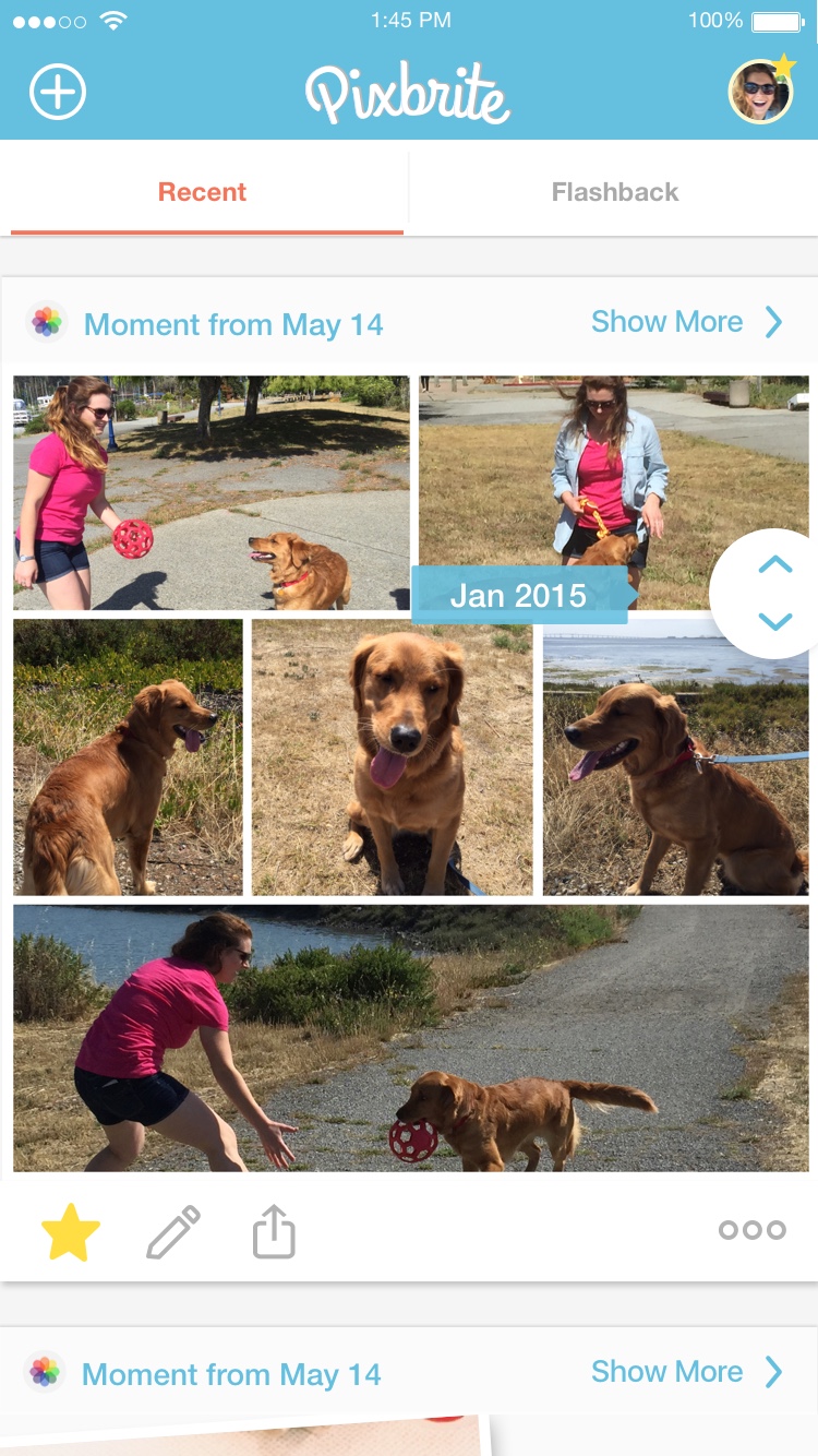
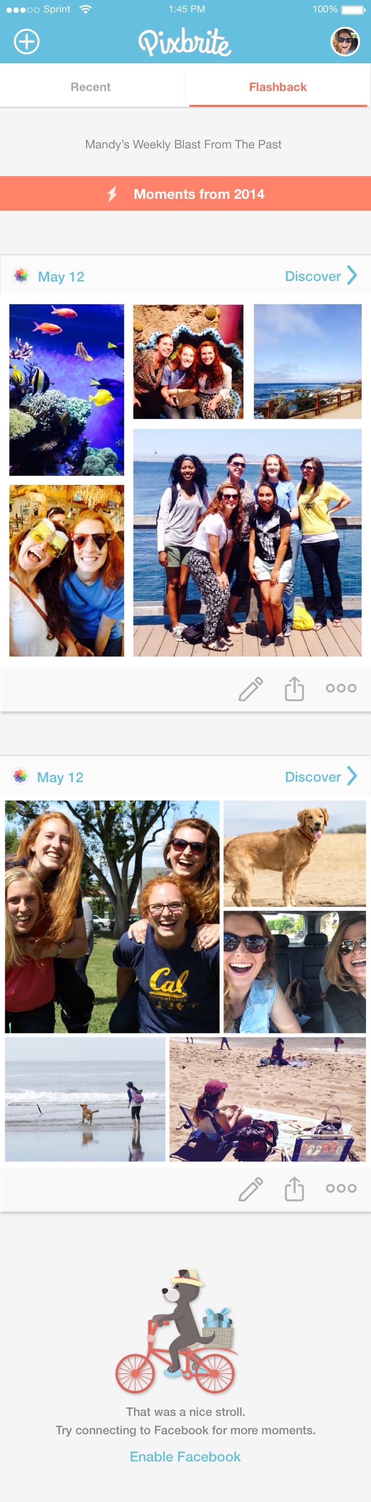
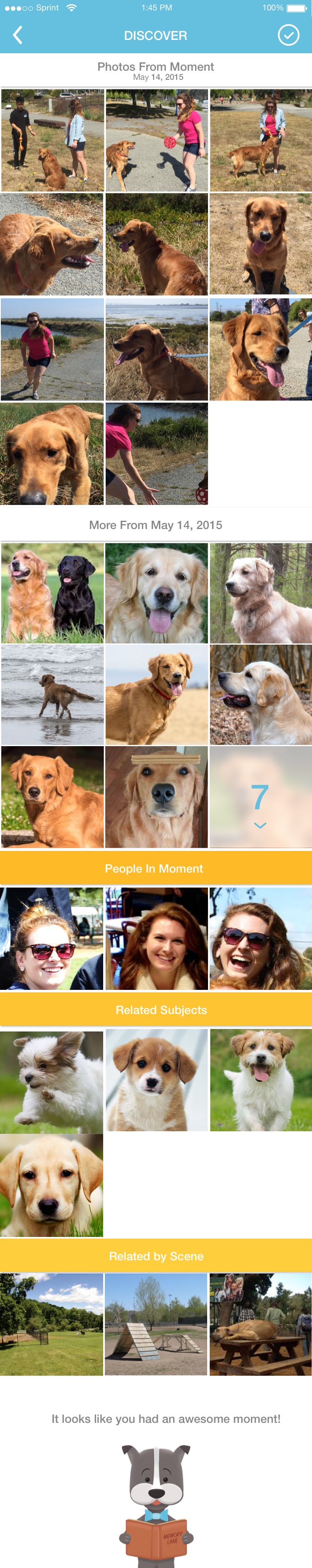
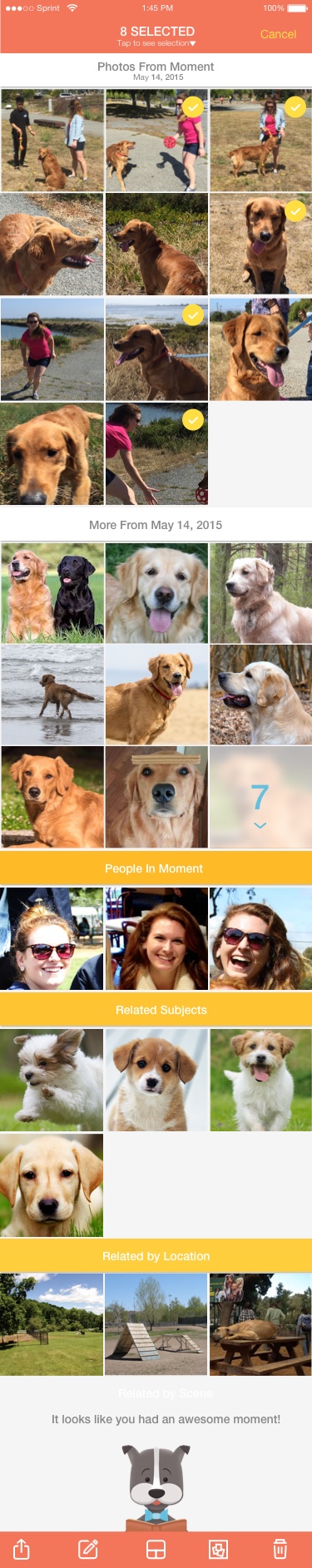
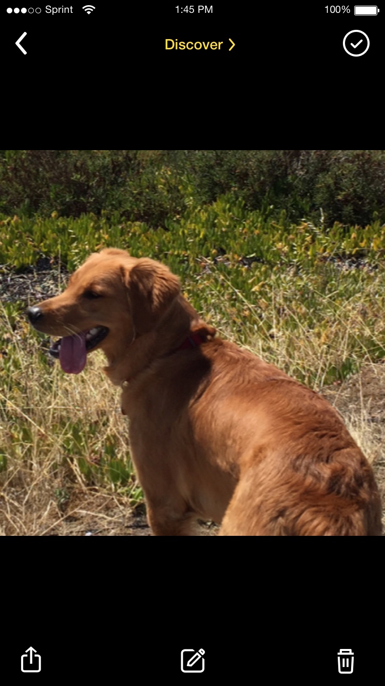
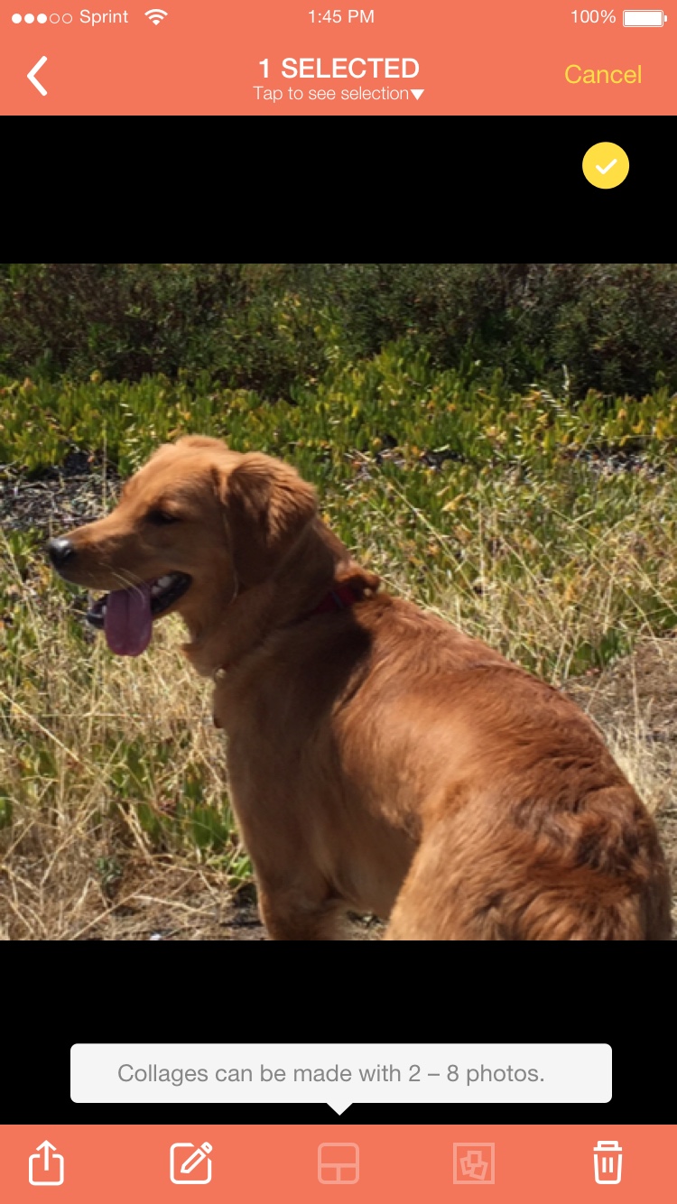
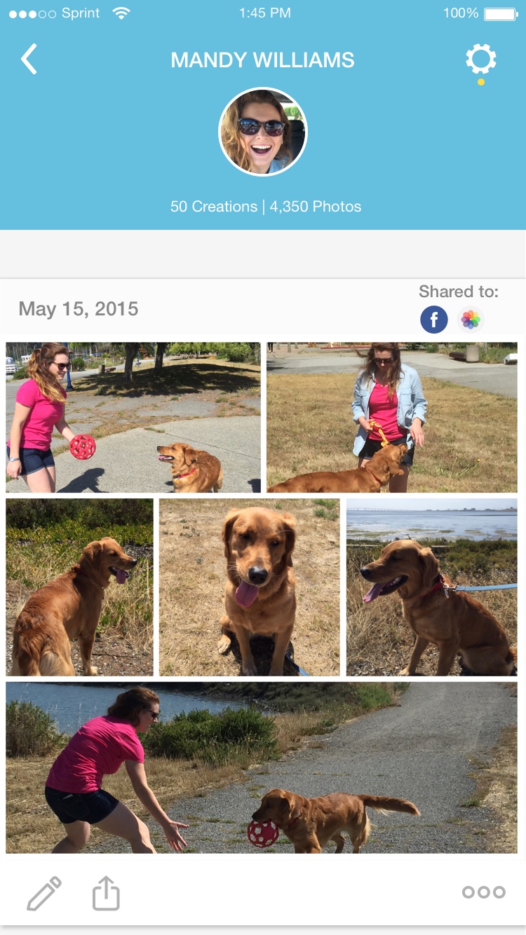
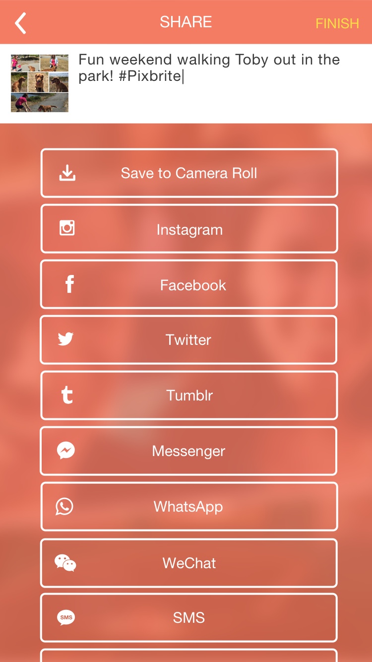


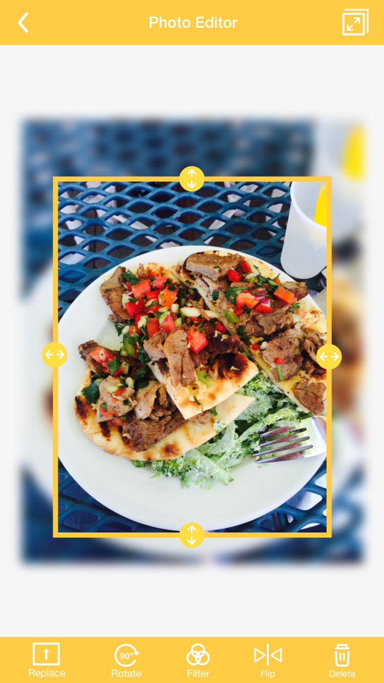

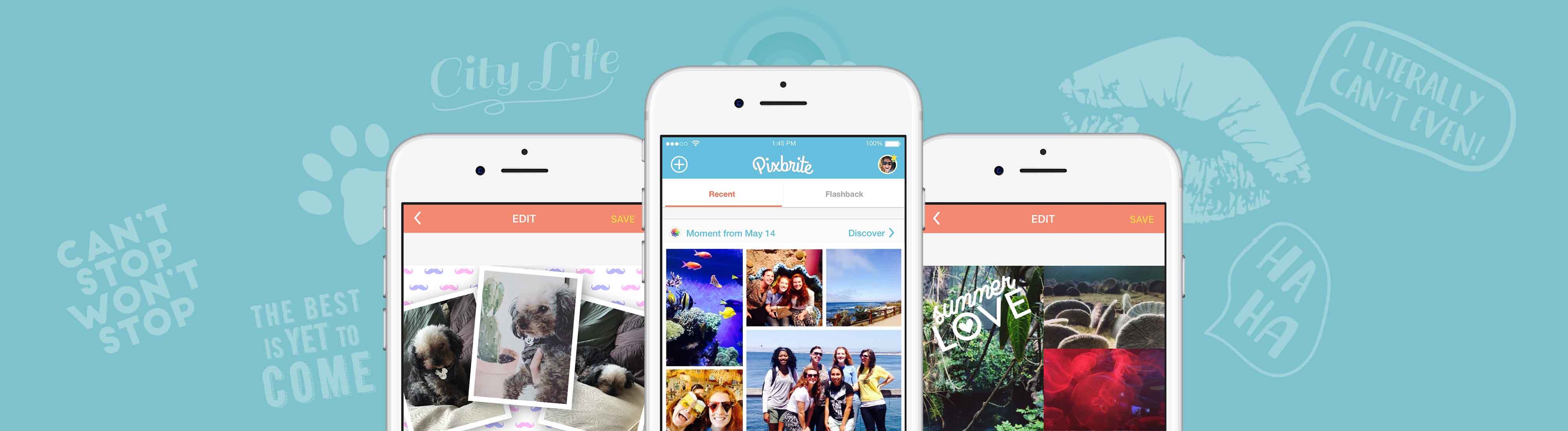
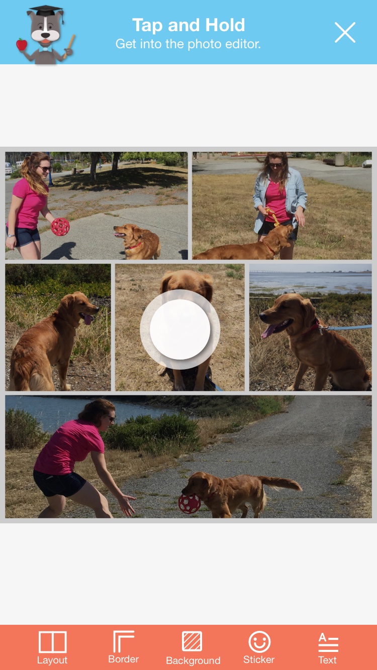
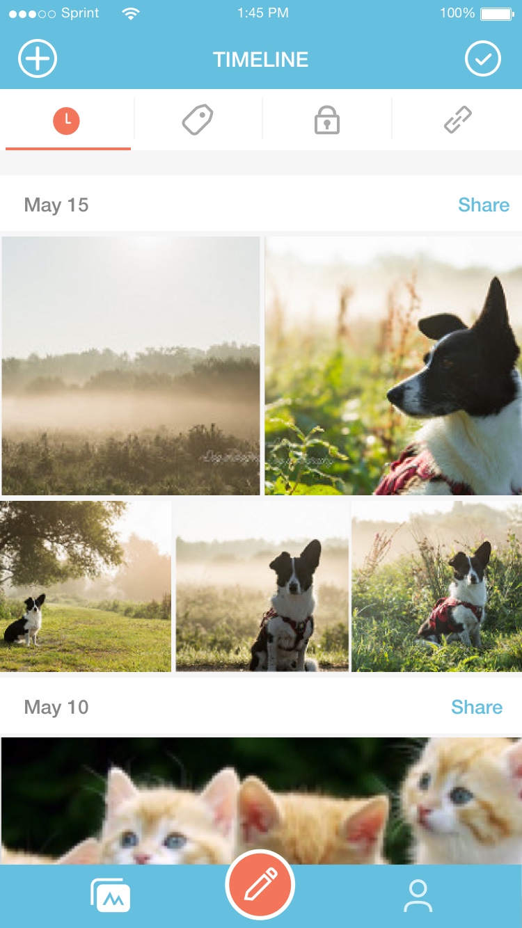
This is the UI that went out for Pixbrite's launch.
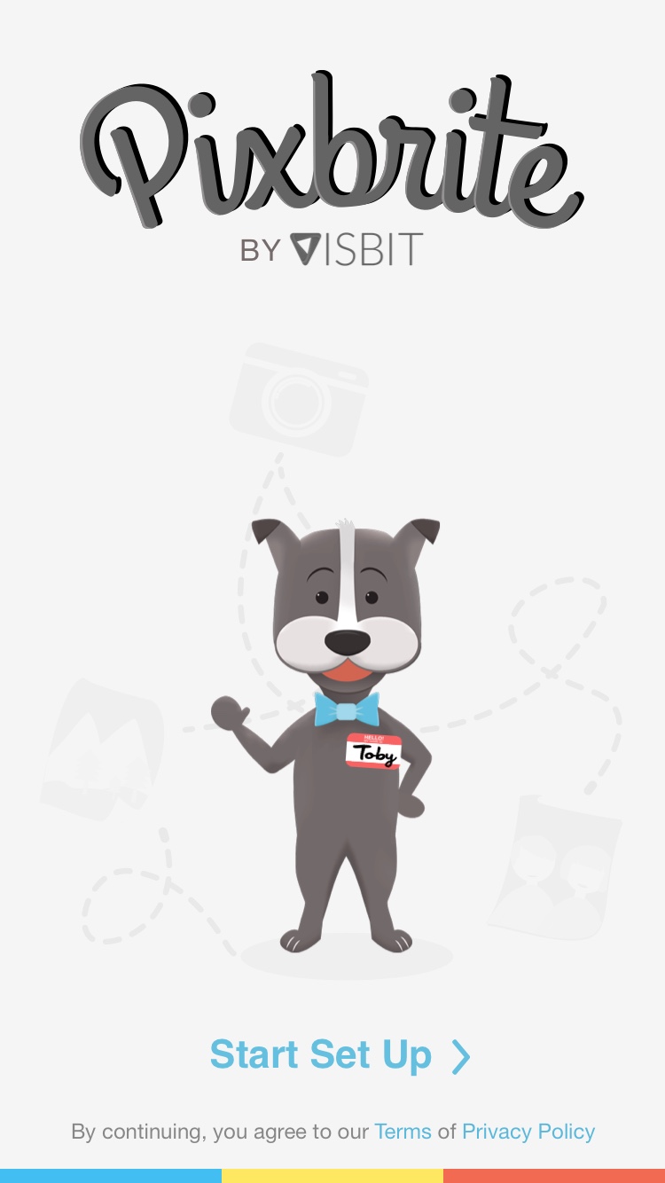
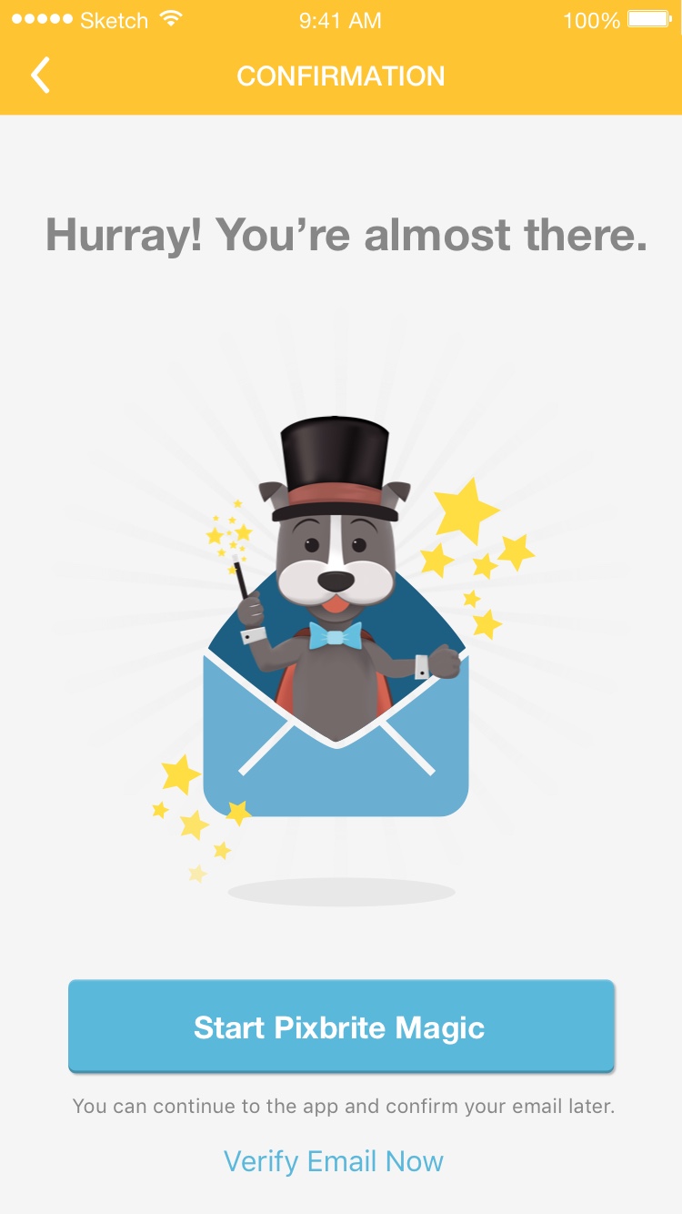
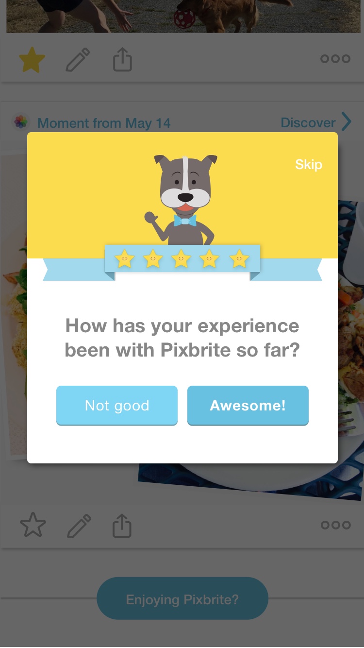
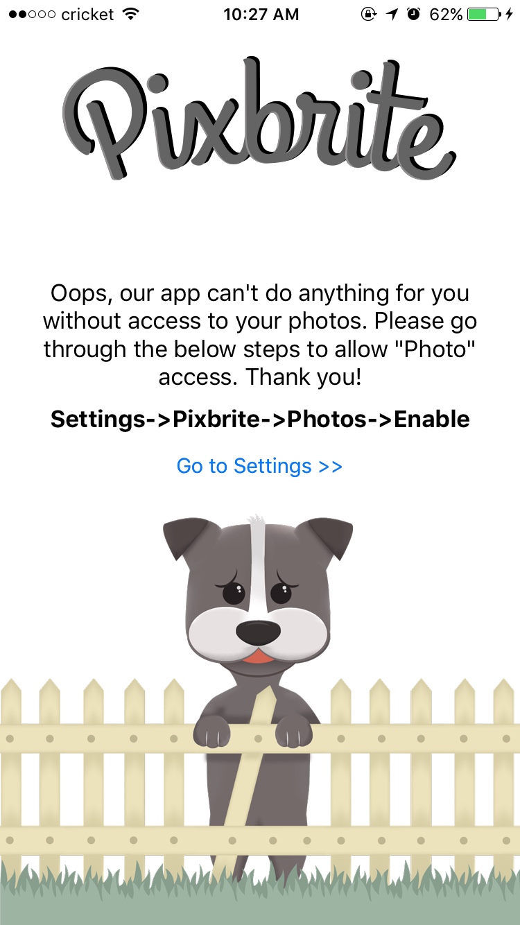
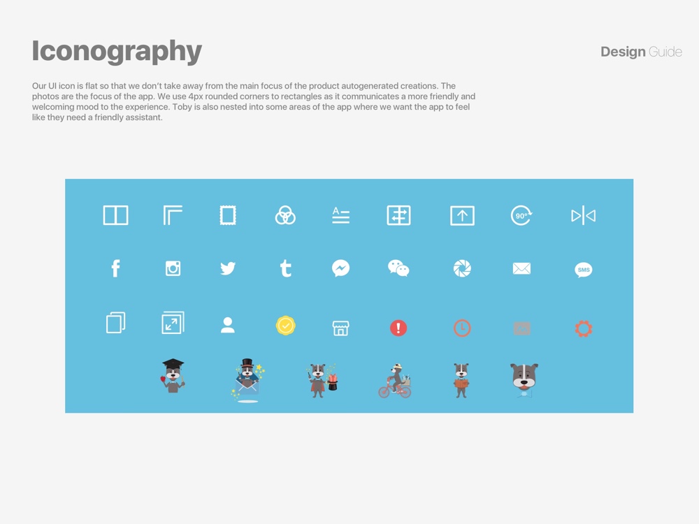
After reading this book, I thought about using the concept of a mascot, Toby the Terrier. Toby would show up throughout the experience when we needed to educate or ask a user to give us permissions.
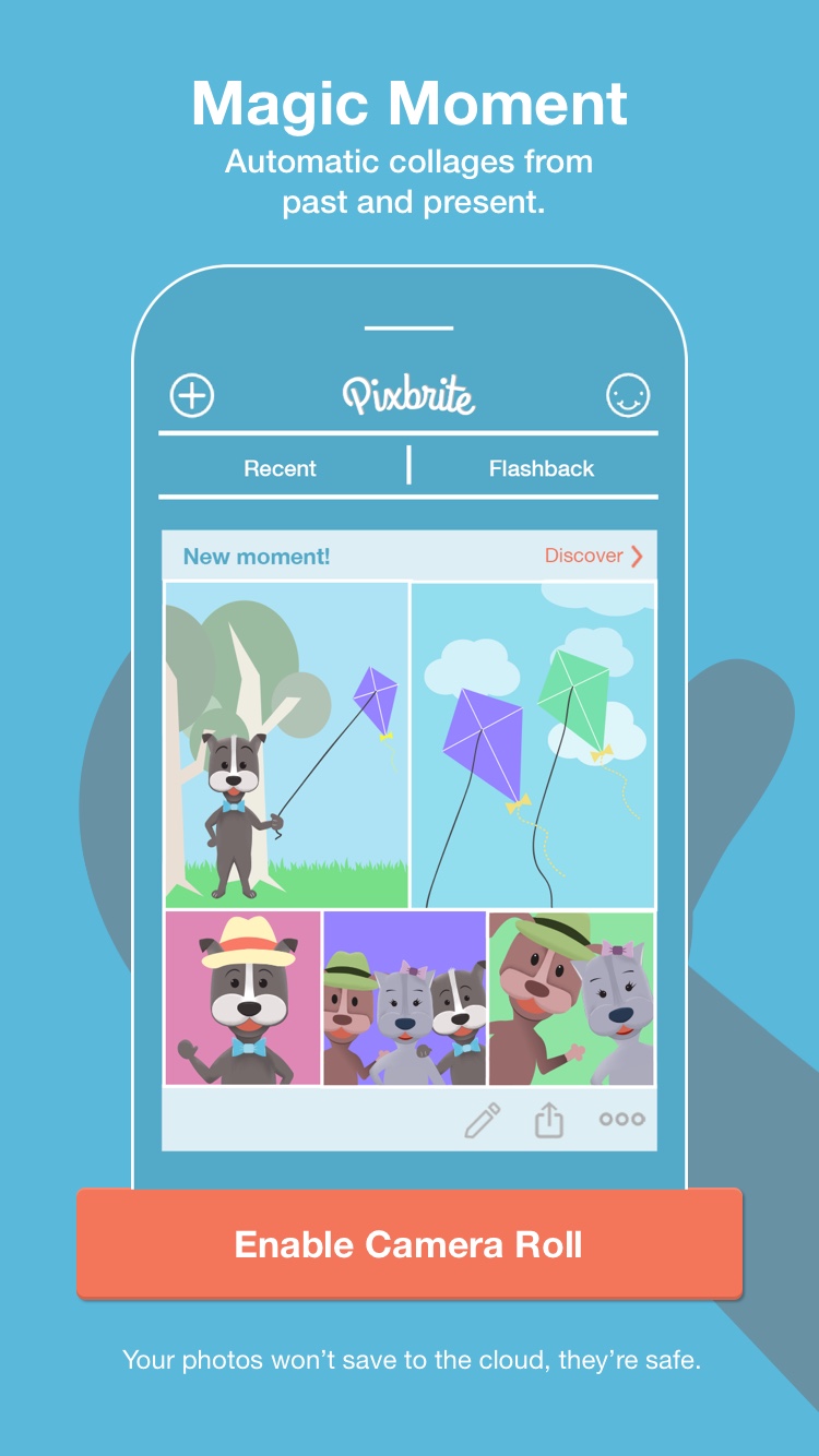

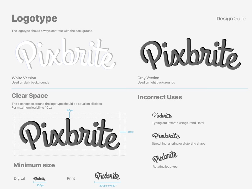
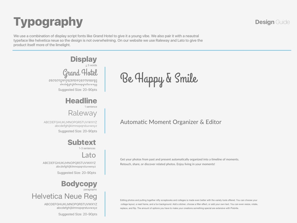
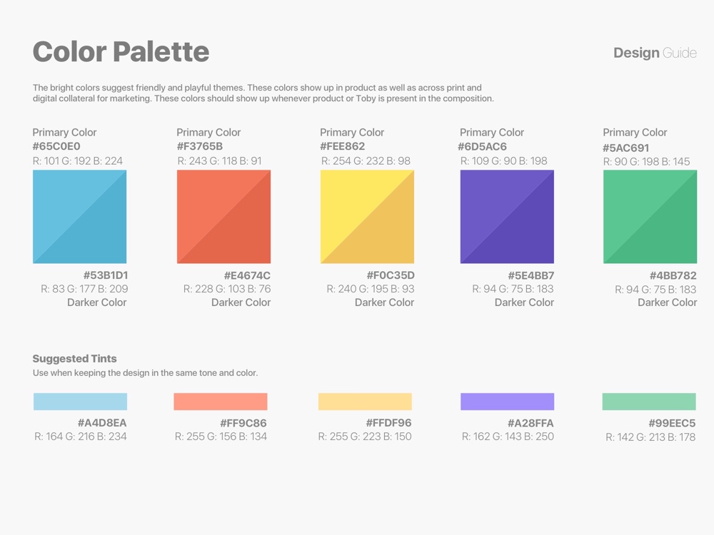
I wanted a young fresh look as it catered to a younger audience. For typography I paired a display script like Grand Hotel with a neutral system typeface like San Francisco that’s native to iOS. The bright colors that were chosen suggest friendly and playful themes. Our primary Blue and Orange product colors were chosen for specific sections of Pixbrite. Blue for the automation as it communicates security and orange for the creation flows as it communicates creativity.
Looking back at the initials problems we were trying to solve, it was interesting to see how the product evolved with research and feedback from user testing. In the end, Pixbrite was more of a “vitamin” product rather than a “pain killer.” By vitamin, I mean it was more of a fun app that grouped photos in a meaningful way, while also giving creative editing tools. It didn’t solve the pain point of photos taking up a majority of storage space, like we initially thought.
If I had more time, I would’ve explored the idea of how we could encourage social behavior to increase Pixbrite's growth. Essentially a utility app is harder to acquire users as it relies on word of mouth. Pixbrite was discontinued a little after its launch as the company pivoted to a VR technology company. Because of that, there wasn’t much we iterated on but we did see slow growth.
When Pixbrite was launched, it was featured in the App Store in 36 countries. Pixbrite had a long run being featured in the US App Store’s photo section from December 2015 - September 2017 in the Photo Organizing and Collage Maker categories.

