I, along with another designer created this Publisher Portal. My job was to lead the product design of Visbit’s ecosystem, which included the Publisher Portal. I took broad concepts and developed them into interfaces and specs for development. Besides playing the role of the designer, I also played the role of a project manager to make sure we were building the right features with an achievable roadmap.
I worked very closely with the co-founders, engineers, and a visual designer. The co-founders would come to me with ideas and I would process what their goals were and make experiences. I communicated with different engineers periodically to ensure that the product was made correctly in an achievable timeframe. As the lead, I tasked the other designer to assist with visual elements.
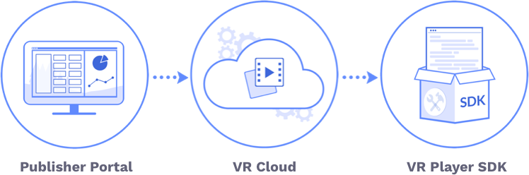
Visbit is an early stage startup that aims to build powerful backend technologies that can be applied towards different mediums like a photo app or Virtual Reality (VR). Visbit saw problems in the distribution funnel of mobile platforms that had 360º videos. These platforms could not stream their 360º videos because the bitrate was too high to stream over traditional streaming, which forced their end user to download a large video file. Viewing 360º videos at anything lower than 4K quality is like seeing the world with fuzzy details, so 4K is the baseline standard to watch 360º videos. This is a problem when you’re trying to get as much viewership onto your platform. After validating these two problems, Visbit Streaming aimed to be a B2B VR streaming service for 360º VR video publishers and content creators.
Project managed video production and assited with visual design and animation. Video also won a Marcom Award.
Take the MVP uploader website and design a platform (Publisher Portal) for a client to upload, manage, and track the performance of their 360º videos. The rapid growth from the video uploading prototype to the Publisher Portal required the design to be more of a scalable design system for the product to be launch ready.
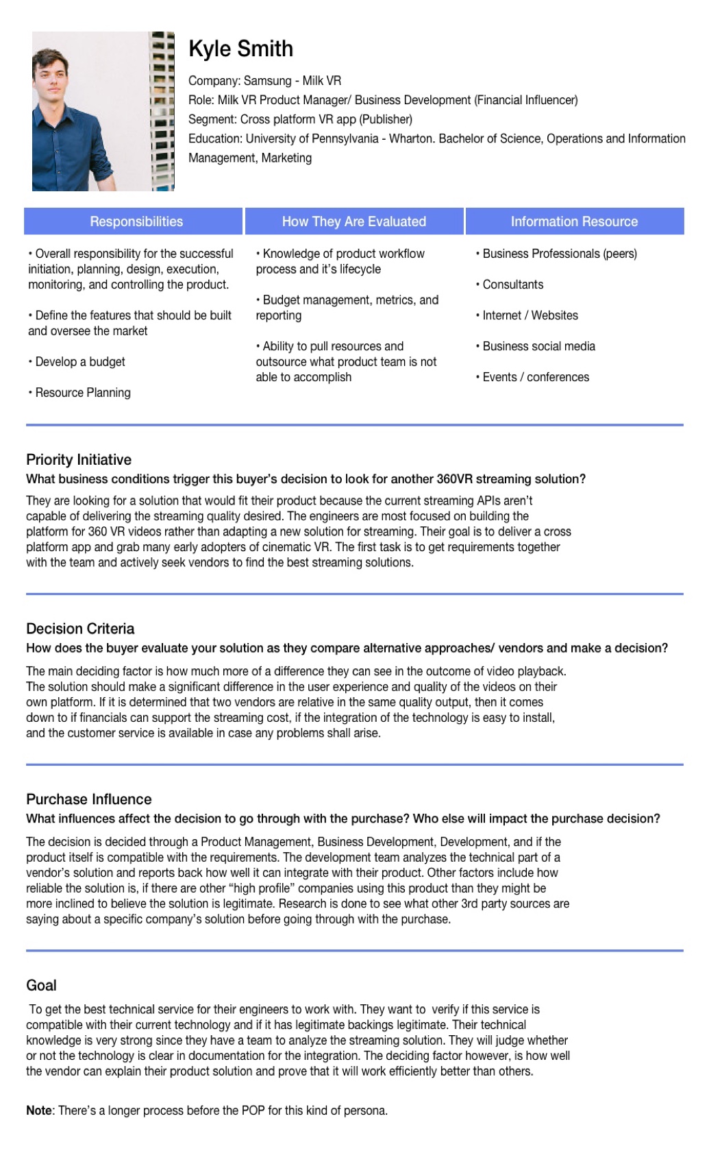
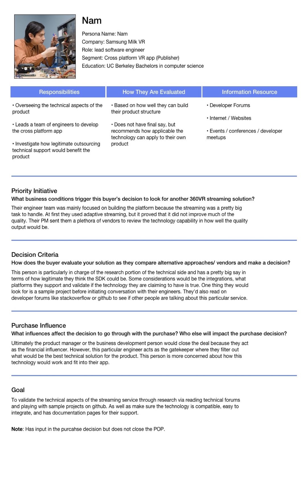
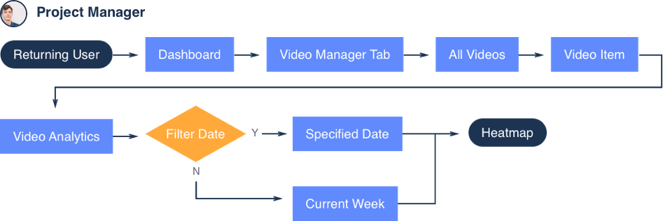
Our target market were companies or studios that did not want to post their content on social platforms like Facebook or Youtube, but rather drive viewership into their own apps or websites. This would allow them to have more control over distribution while also monitoring their performance. These hypothetical personas below were created based on online research and from talking to meetups/conferences. Personas were not only helpful in designing the Publisher Portal, but also the flow to navigate through our website and demo apps. There are three personas that were created based upon certain jobs: project manager, developer, and filmographer.
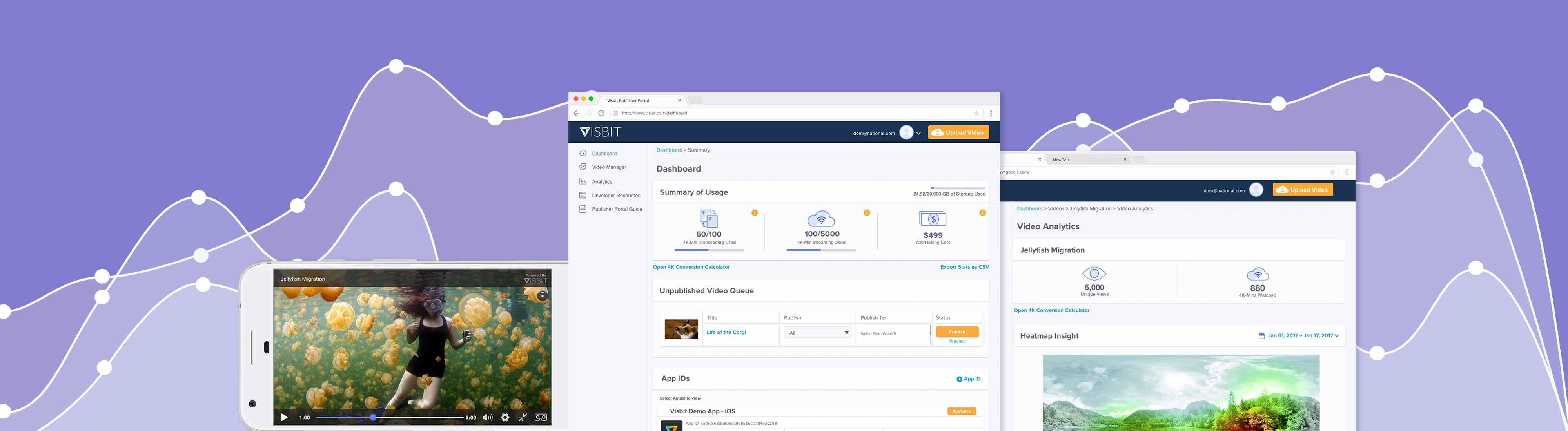
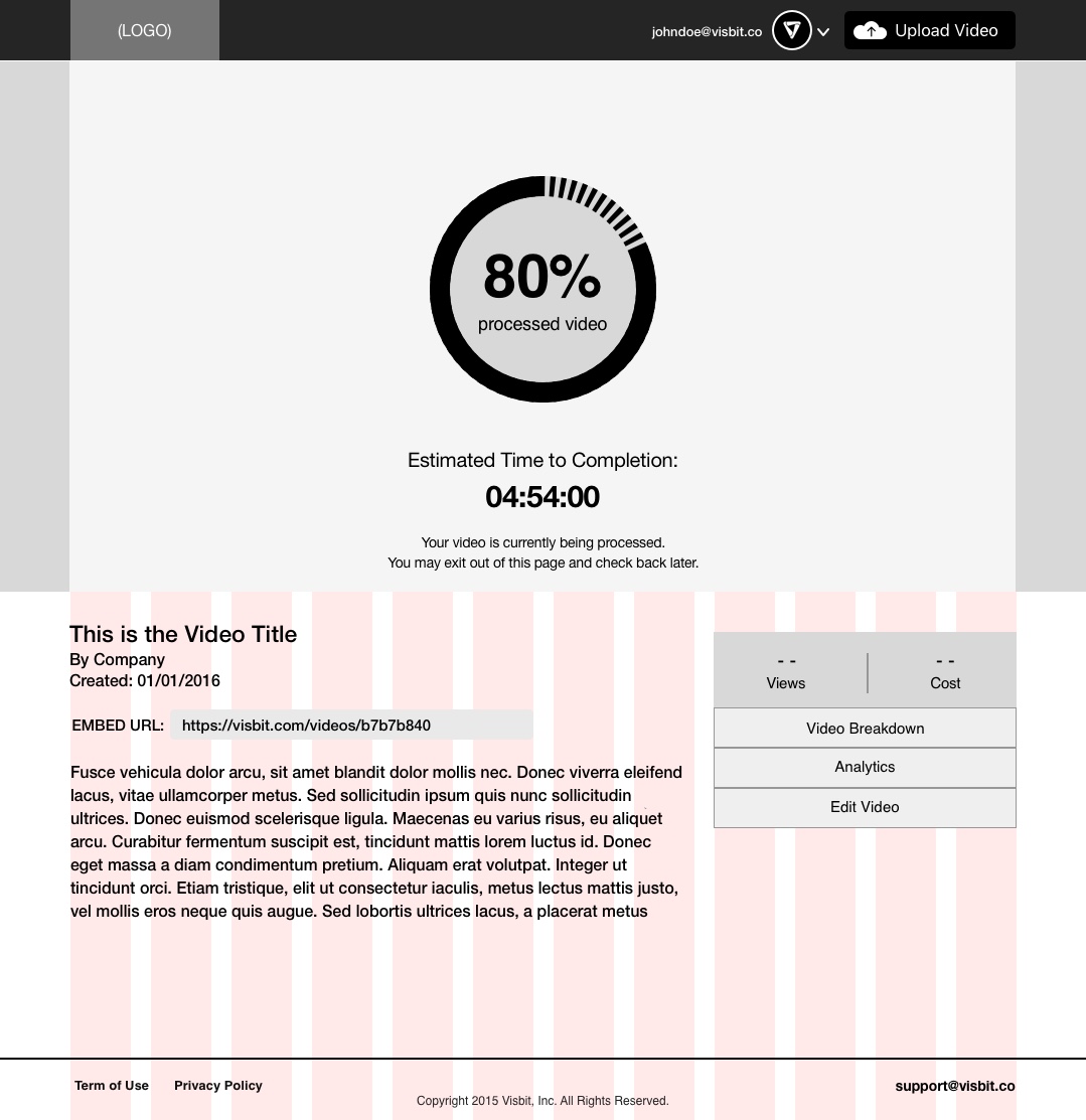
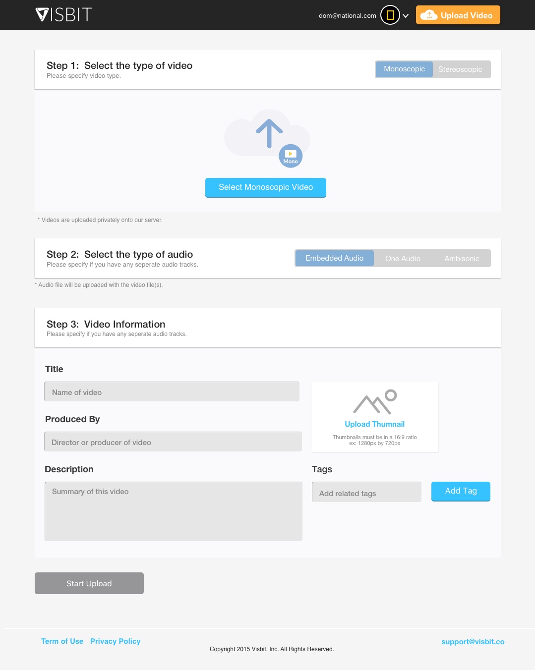
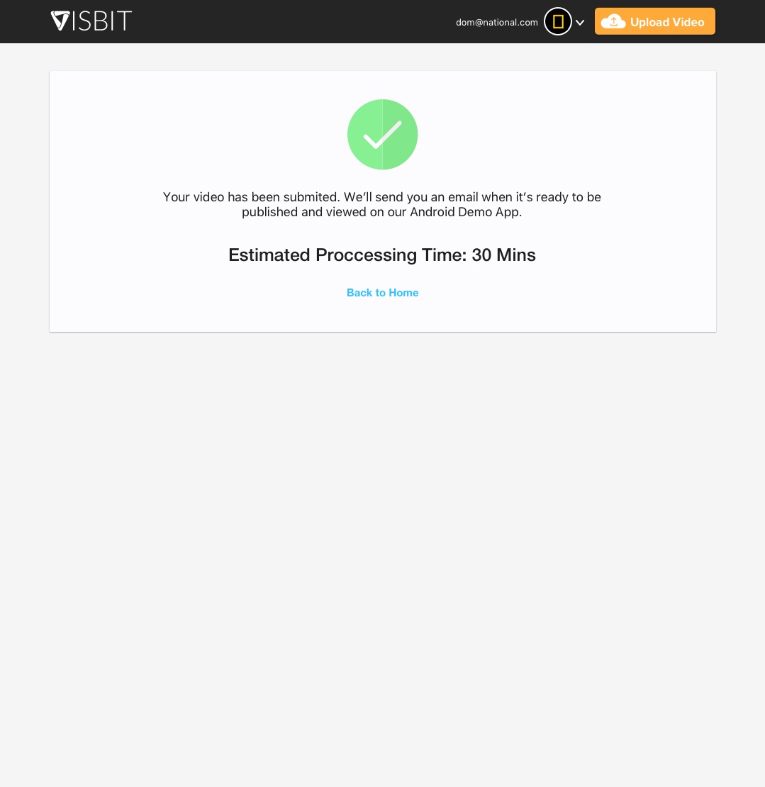
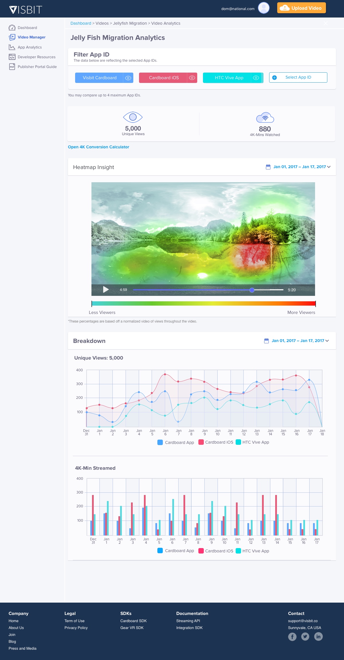
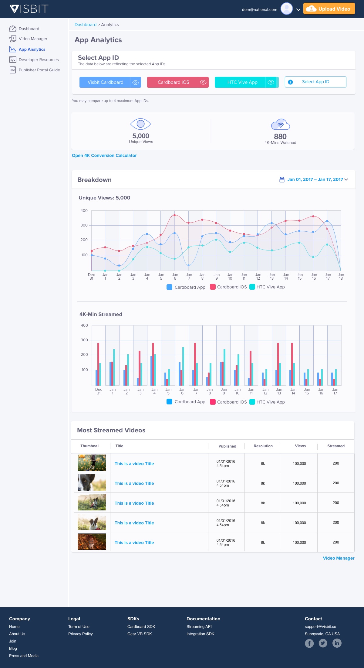
To test a complete product pipeline, we needed a quick and easy website that could upload videos to be submitted to our cloud system for transcoding. This transcoded video is then later streamed down to the VR Player SDK. Once we validated that the core feature was a functional pipeline we expanded the set of features that became the Publisher Portal. The initial design was focused more on the uploading experience and tracking the usage of our service versus monitoring the performance of their videos. At the time of testing, we did offer basic analytics where a user was able to monitor the views and streaming usage. If a user did find what was under the dropdown menu, they were going to “BI analytics” to see the app performance as well as the heatmap in individual videos.

Wireframes layed out the content and functionality for the purpose for uploading videos onto our SDK.

We didn't focus on the visual style for the MVP but more of the core functionality.
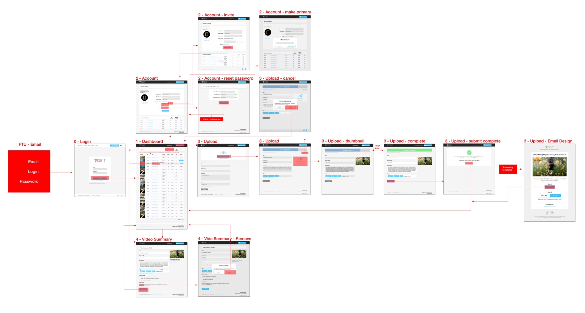
The interaction map of the MVP, which focused on the uploading experience.
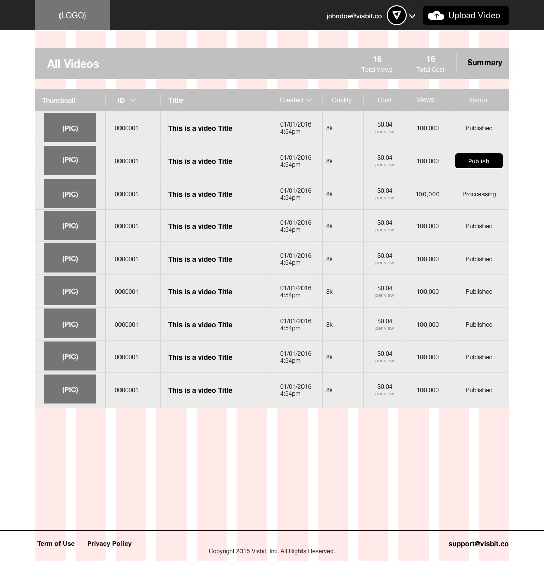
Before launching the official product, we needed to solidify the Publisher Portal to a more cohesive and understandable structure. While I was proud of how quickly the MVP uploader website was built, the Publisher Portal's features outgrew the structure that satisfied the purpose of testing with beta and MVP designs. We decided it was integral to the experience that the Publisher Portal was functional as it was the main hub to our services. The Publisher Portal was the dashboard where a user could publish, manage, and now get analytics to their 360 videos. In it’s current state, it wasn’t scalable and harder to go through as there was no navigation and the design couldn’t accommodate upcoming features in the pipeline. Ultimately, it felt clunky and an upgrade was necessary before we pushed heavily for sign ups.
We conducted a design workshop between myself and another designer as a brainstorm for UI concepts that had the most potential to provide the best experience. After getting all the ideas out, I talked with engineers to understand what was possible with the libraries and framework they already built the system on. After back and forth discussion we settled on a concept between all parties that suited our short term goals, other parts of the concept were pushed to stretched goals for another sprint in the future.
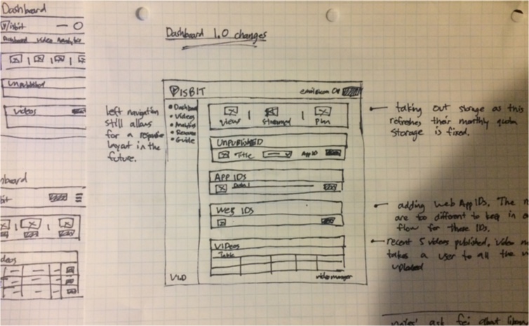
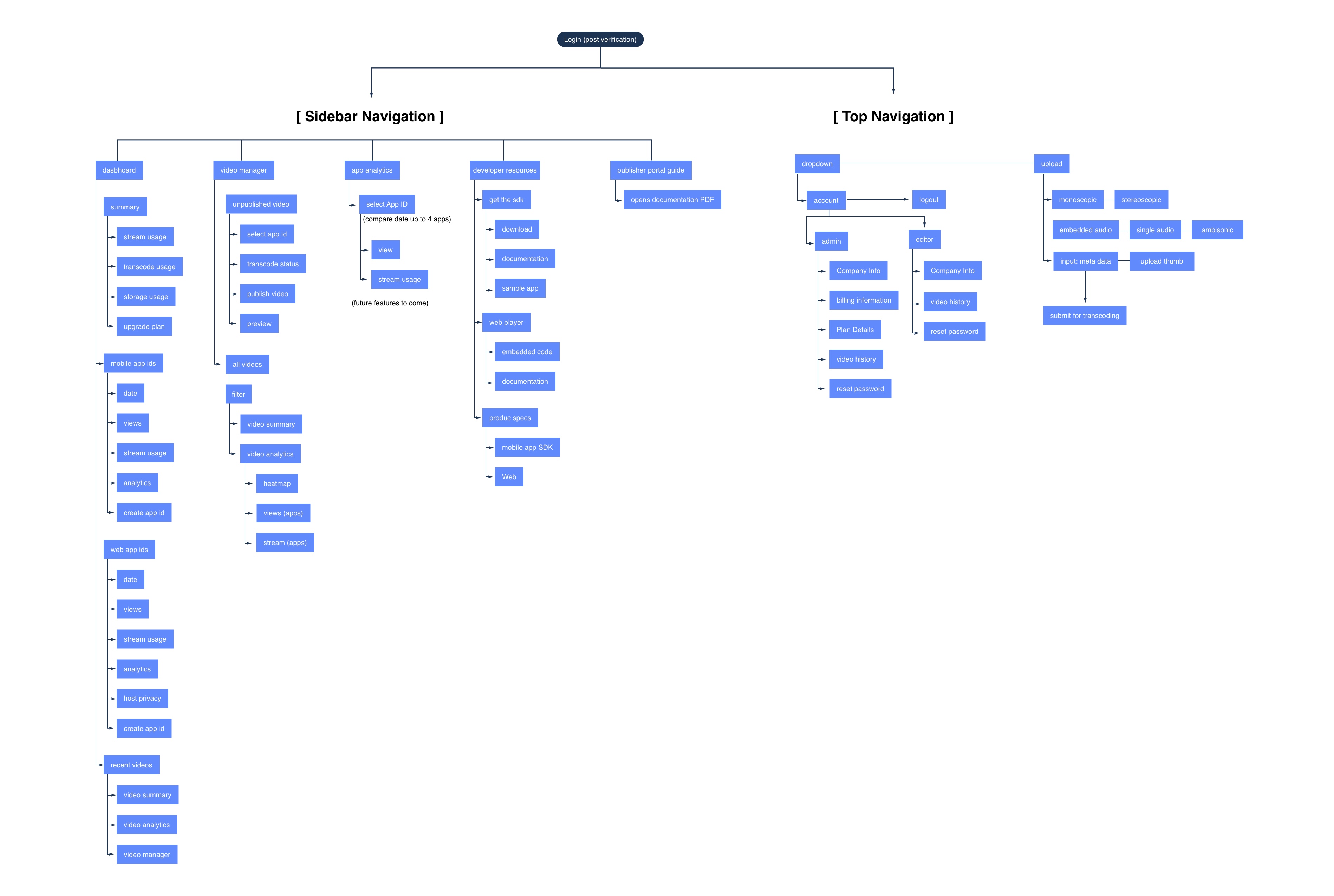
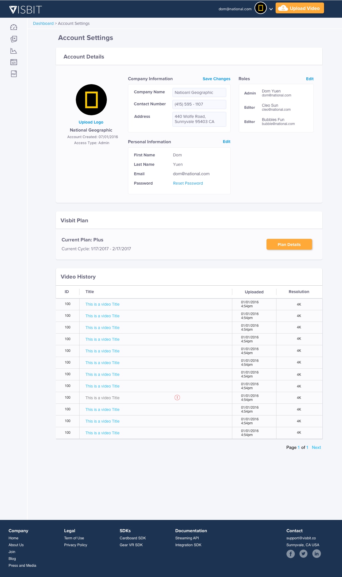
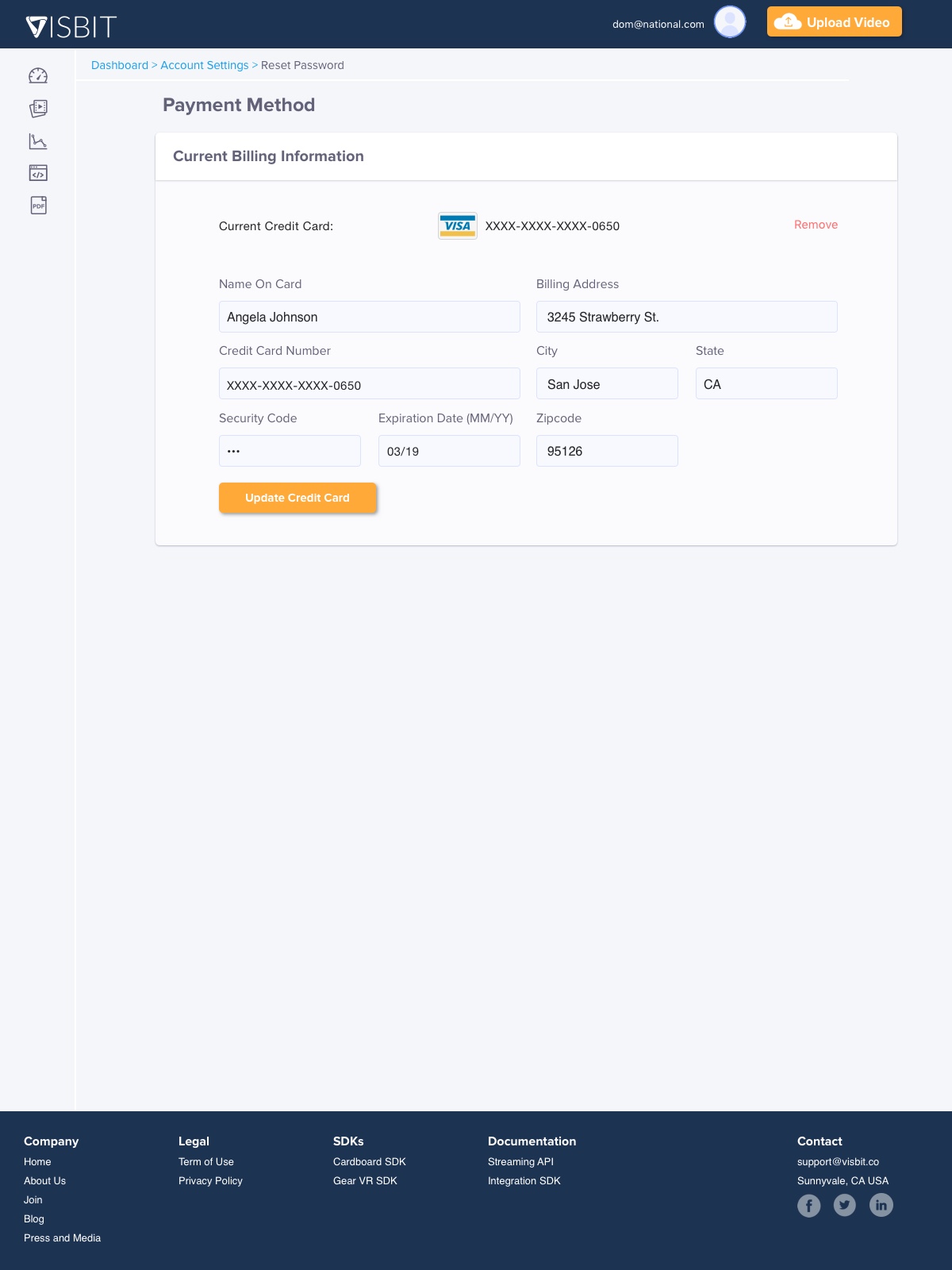
The most important change was the addition of the left sidebar navigation and grouping information into tabs for a more logical flow. The navigation bar on the left versus on top allowed more space for features to live. There was a conscious decision that everything relating to the product or the user’s 360º videos would be live on the left navigation, while information pertaining to their Visbit account stayed in the dropdown at the top. Showing the specified tabs helped discoverability and optimized their task flow.
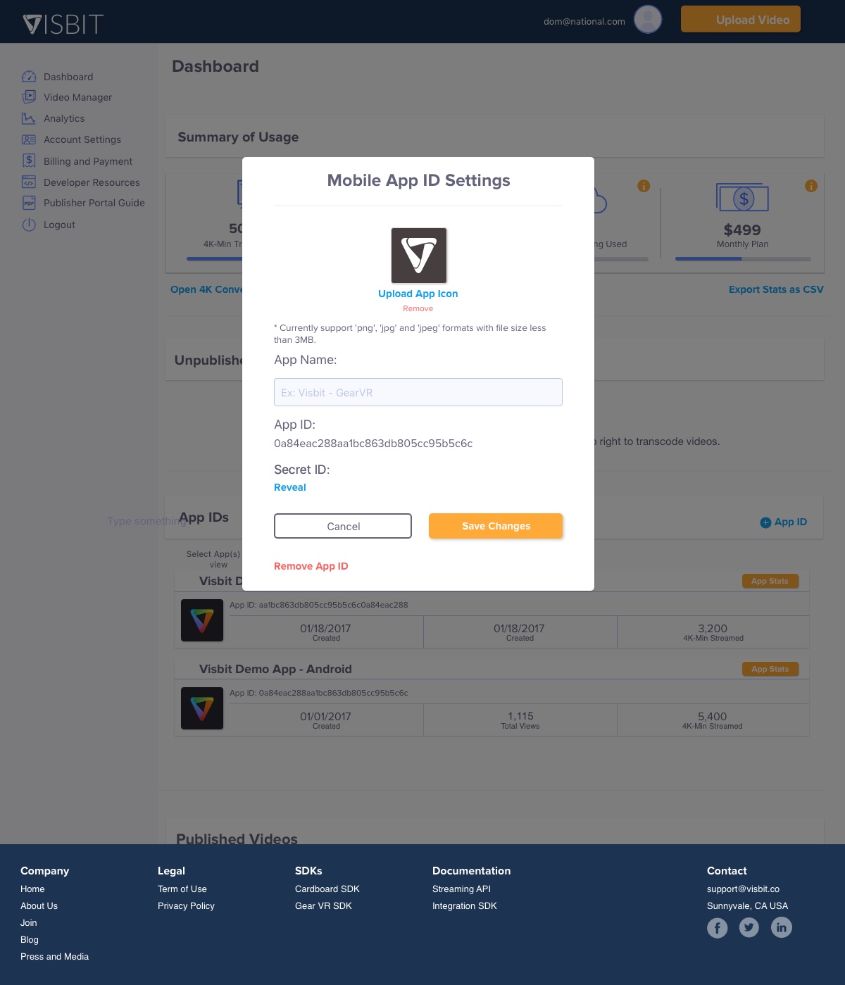
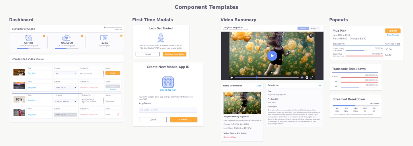
Dashboard: The home section where a user could find unpublished videos, App IDs, and recently published videos.
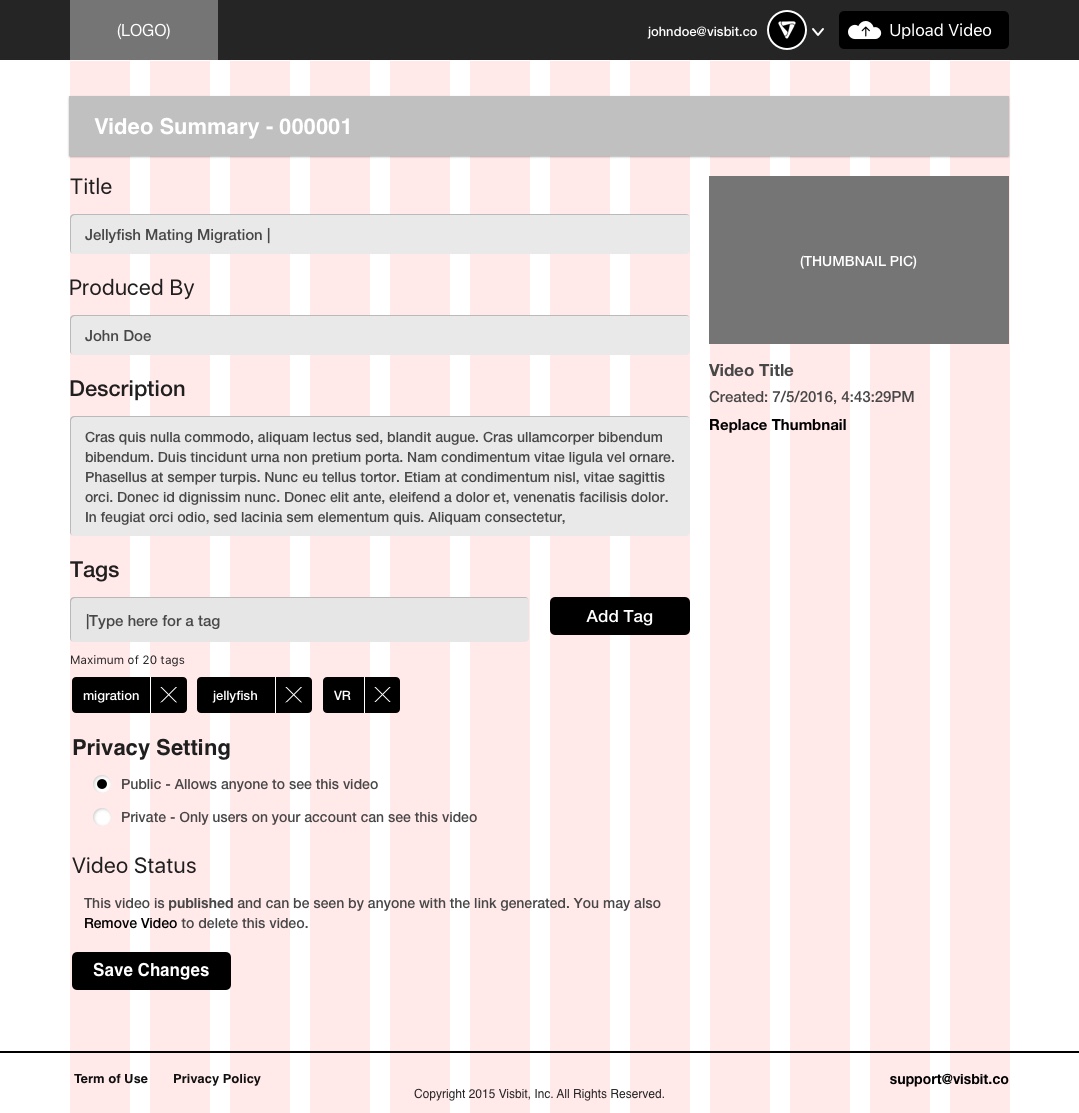
Video Manager: Table of all their videos, video analytics, video summary, and managing the publish settings.
App Analytics: Analytics pertaining to their app IDs
Developer Resources: Documentation and downloading SDKs for a developer
Publisher Portal Guide: A PDF that details each section of how the Publisher Portal operates
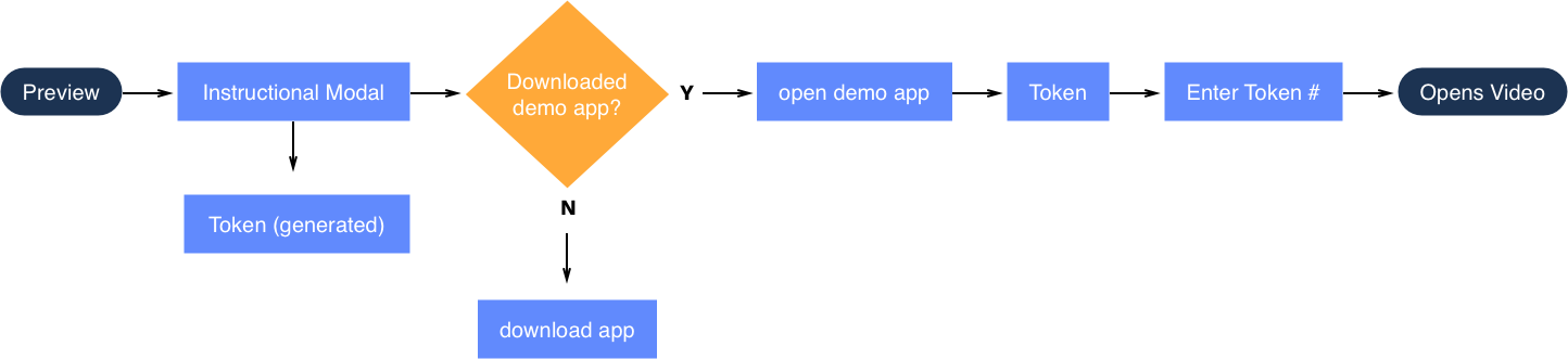
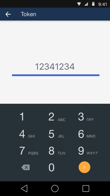
More features were also added, like the preview feature to help sell the product. We leveraged our Visbit Demo App so a user could preview how their video would look like via token before publishing onto their own platform.


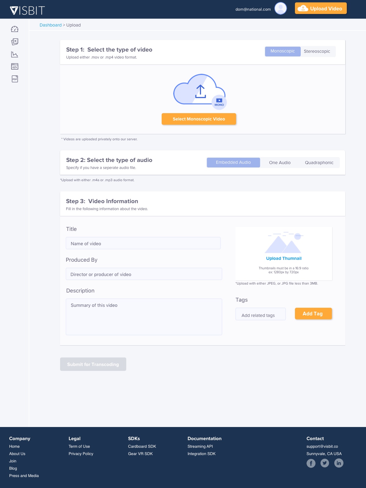
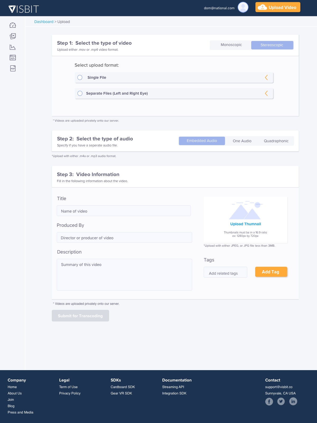


Publisher Portal 1.0 UI was revised to reflect what is currently public.
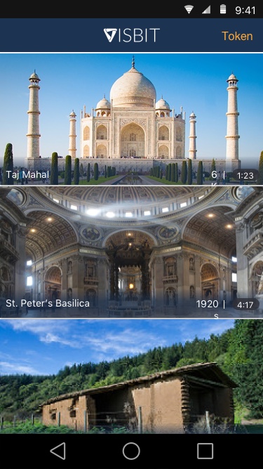
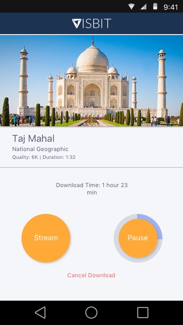
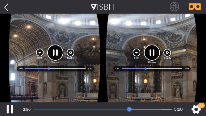
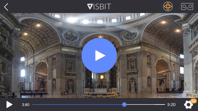


The demo app was used for a client to preview content and our sales team to showcase our technology.
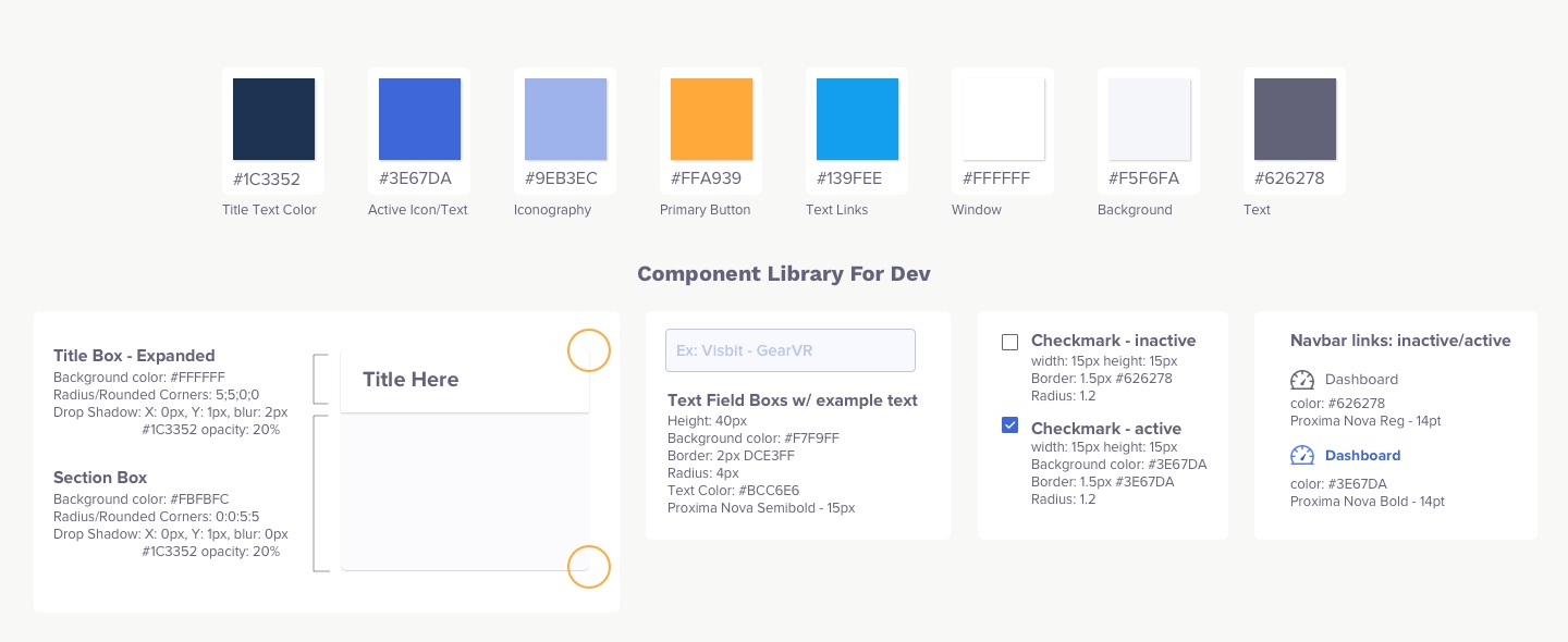
I came across this article while working on the UI and after discussion with engineers, decided to create UI components. On the design side we created a component library, where the styles could be applied to different areas of the Publisher Portal as the system grew. Ultimately we created a Visbit style guide to not only aid our process on the design side, but also also keep consistency between design and engineering. At the end, the style guide helped unify the UI design across the demo apps, website, and Publisher Portal.
Through the process of creating the Publisher Portal from a simple uploading mvp to this more complex system, we learned a lot about how users use the product and how our product fits into the market. While I can’t disclose specific details, we did see more clicks on certain pages because the discoverability was better. Surveys were ran, with good ratings about the portal itself. Users were able to navigate through the portal without a problem. Looking back, I would have defined the metrics early on as to get exact numbers for specific flows. I did not realize that this information couldn’t be looked up afterward as there were limitations to Google Analytics. Overall, I learned a lot about how B2B designs and user experience (sales experience) works by designing this product.
TechCrunch PR Newswire Oculus Store